MFT PHYS_pp#
Expendable MFT tasks#
Currently all MFT tasks are marked as non-critical (= if the task crashes, run will keep on going):
If an MFT task crashes during a PHYSICS run, please immediately call the MFT on-call and create a log entry tagging MFT.
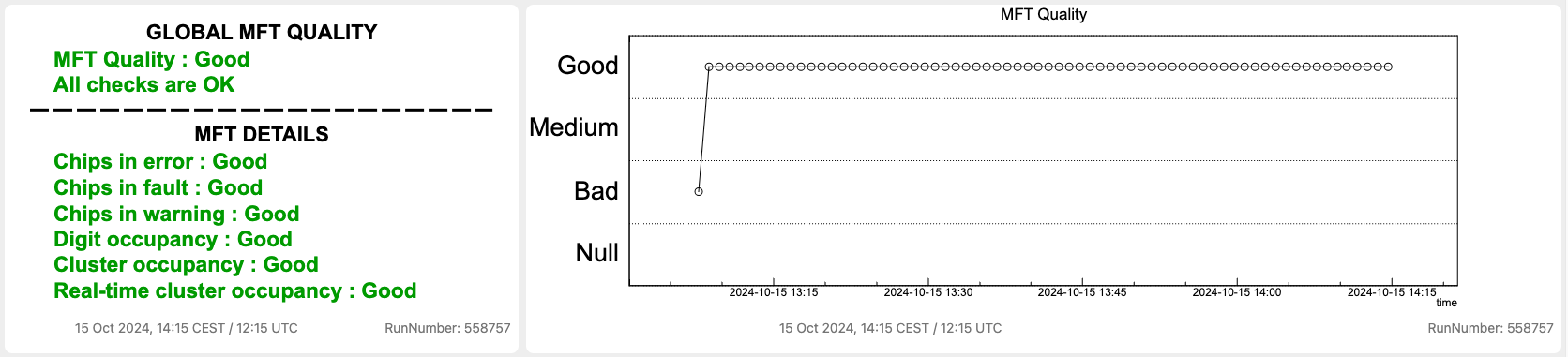
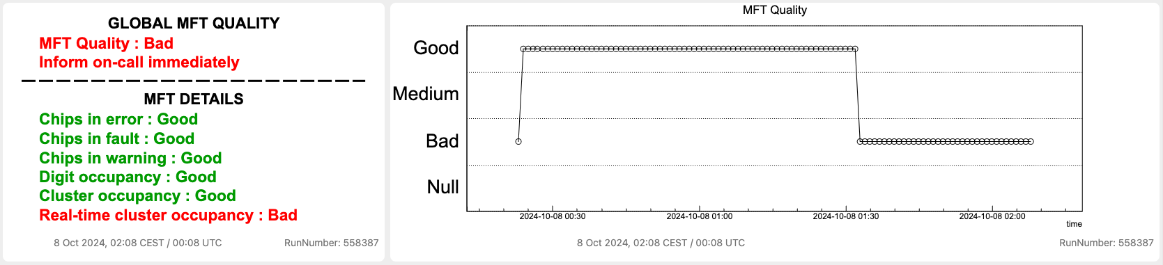
Quality summary#
The left panel summarizes all MFT QC checks for the last QC cycle. The top row provides a summary of the quality status with a text message suggesting actions to be taken:
- Quality: Bad - call the MFT on-call immediately
- Quality: Medium - In case of MFT medium quality, do a log entry tagging MFT and inform the SL (the SL will ask the DCS shifter to perform a chip reconfiguration). Once the SL informs you that the DCS shifter has performed the chip reconfiguration, wait 2 QC cycles (2x 1 min) to check that the quality is back to good. If it remains medium, call the MFT on-call shifter.
- Quality: NULL - QC objects were not created
The right panel provides a time trend of the MFT quality summary.
Good quality example:
Bad quality example (triggered by the real-time cluster occupancy):
Chips in Error/Fault/Warning#
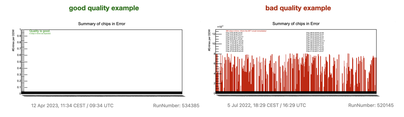
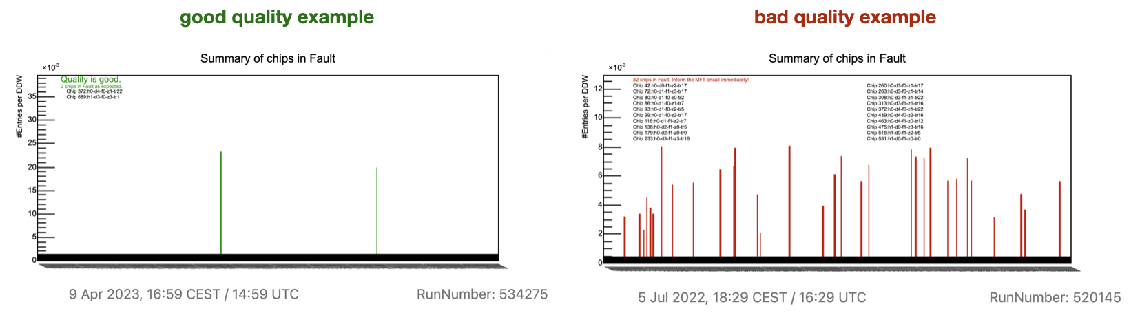
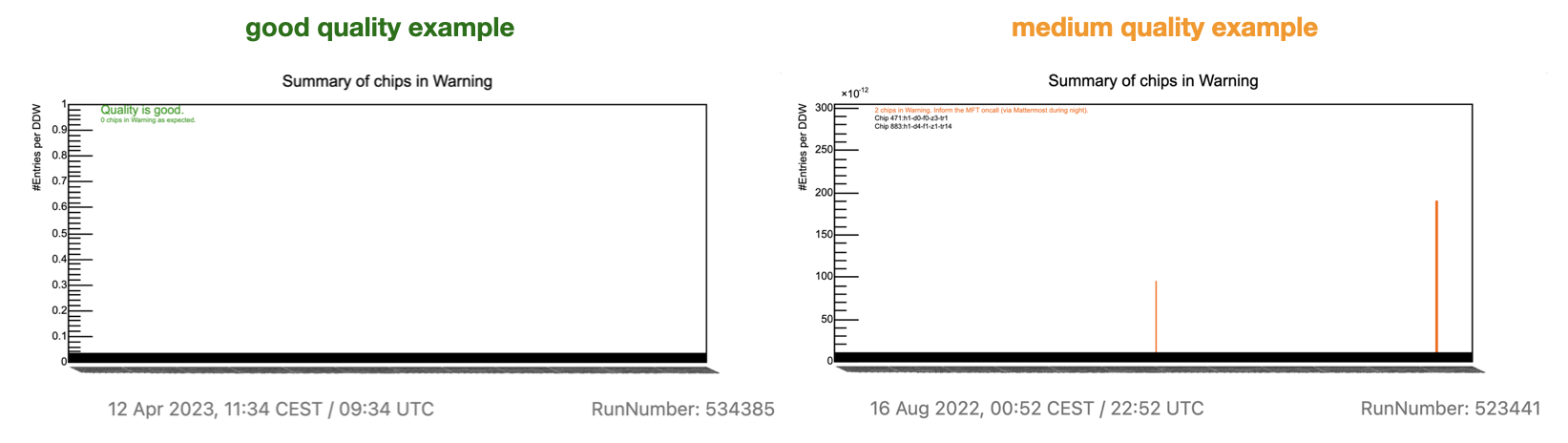
- Description: this plot is created on the FLPs and shows the number of MFT chips in Error/Fault/Warning. Up to the first 20 chips are explicitly listed.
- Checks to be done: there is an automatic checker on the number of chips in E/F/W.
- Actions to be taken: follow the instructions in the plot. The MFT has automatic chip recovery that is triggered if a certain amount of chips in E/F is reached:
- Call the on-call if the quality remains Bad for more than 2 minutes.
- For medium quality create a log entry tagging MFT and inform the SL who will ask the DCS shifter to perform a chip reconfiguration. Once the SL informs you that the action is done, wait 2 min to check that the quality is back to good. If it remains medium, call the MFT on-call shifter.
Digit Occupancy Summary#
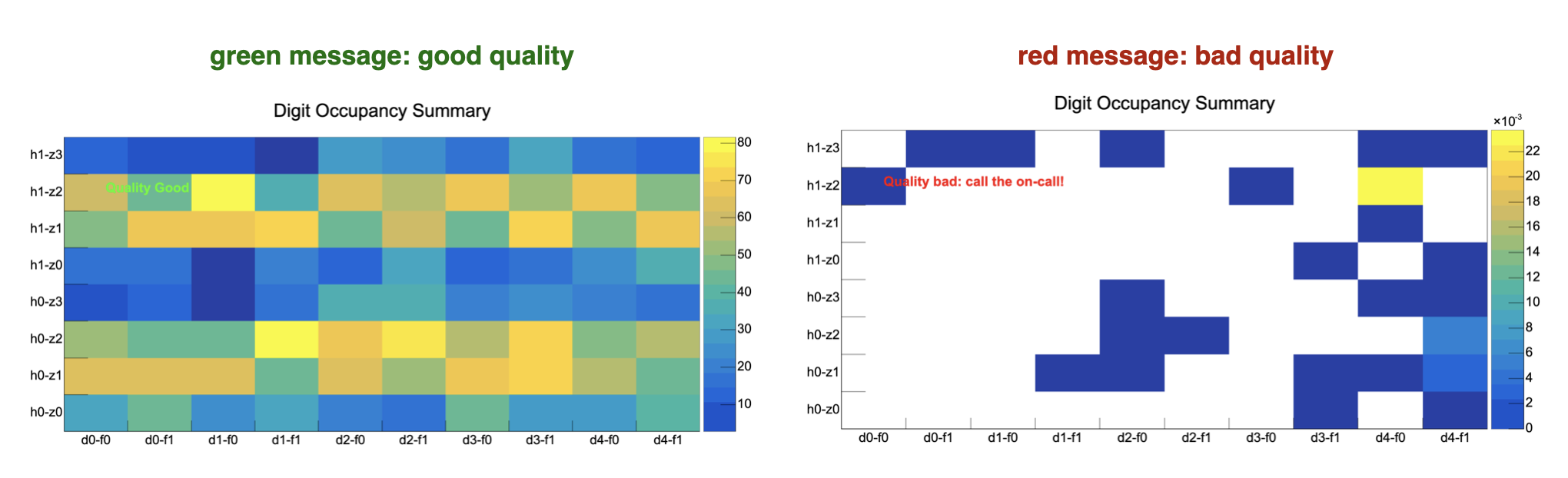
- Description: this plot is created on the FLPs and shows the number of digits per MFT zone per LHC orbit. It contains all data since SOR.
- Checks to be done: there is an automatic checker for empty ladders (each MFT zone is composed of multiple ladders).
- Actions to be taken: follow the instructions in the plot:
- The quality turns Medium if some individual ladders are empty: create a log entry tagging MFT and inform the SL who will ask the DCS shifter to perform a chip reconfiguration. Once the SL informs you that the action is done, wait 2 min to check that the quality is back to good. If it remains medium, call the MFT on-call shifter.
- If at least two adjacent ladders are empty, the quality turns Bad: call the MFT on-call immediately.
Cluster Occupancy Summary#
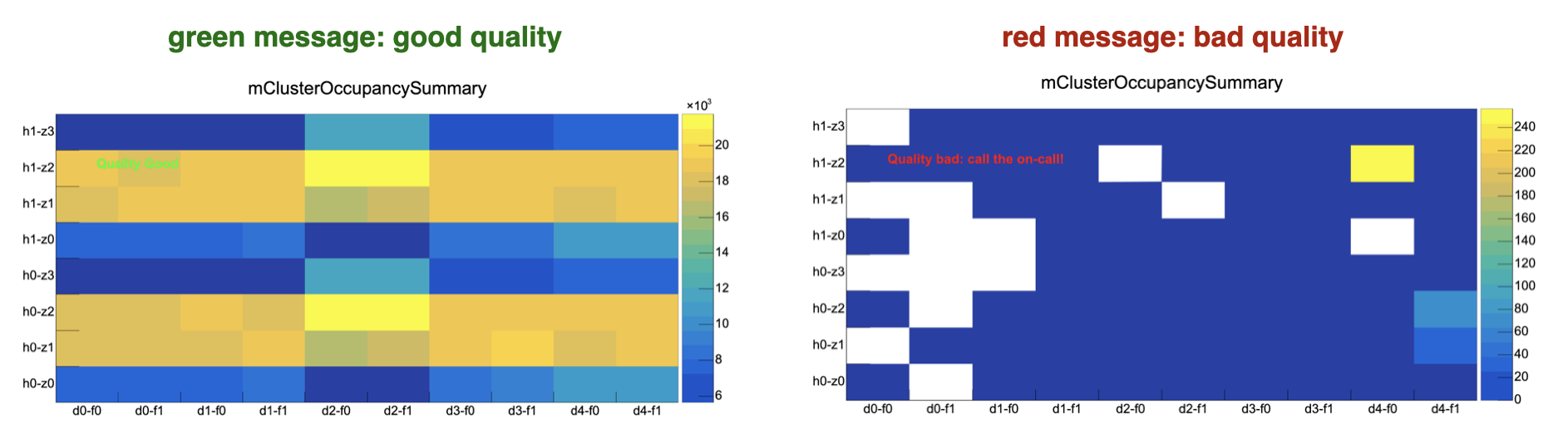
- Description: this plot is created on the EPNs and shows the number of clusters per MFT zone per LHC orbit. It contains all data since SOR.
- Checks to be done: there is an automatic checker for empty ladders (each MFT zone is composed of multiple ladders).
- Actions to be taken: follow the instructions in the plot:
- The quality turns Medium if some individual ladders are empty: create a log entry tagging MFT and inform the SL who will ask the DCS shifter to perform a chip reconfiguration. Once the SL informs you that the action is done, wait 2 min to check that the quality is back to good. If it remains medium, call the MFT on-call shifter.
- If at least two adjacent ladders are empty, the quality turns Bad: call the MFT on-call immediately.
Real-time Cluster Occupancy Summary (last ~2 mins window)#
- Description: this is the same plot as Cluster Occupancy Summary, but it only contains data from the last time window (duration approximately 2 mins).
- Checks to be done: there is also an automatic checker for empty ladders with the same settings. The output of this checker corresponds to the "Real-time cluster occupancy" shown in the "Quality Summary" at the top.
- Actions to be taken: follow the instructions in the plot:
- The quality turns Medium if some individual ladders are empty: create a log entry tagging MFT and inform the SL who will ask the DCS shifter to perform a chip reconfiguration. Once the SL informs you that the action is done, wait 2 min to check that the quality is back to good. If it remains medium, call the MFT on-call shifter.
- If at least two adjacent ladders are empty, the quality turns Bad: call the MFT on-call immediately.
Track phi distribution, track eta distribution#
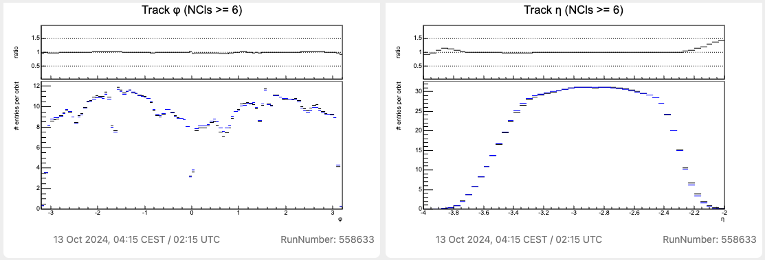
- Description: these plots are created on the EPNs and show the track phi and eta distributions (normalized by the number of LHC orbits).
- Checks to be done: data from the current run are black, while the reference histogram plotted in the background is blue. Both histograms should look similar.
- Actions to be taken: if the black histogram significantly deviates from the blue reference (the ratio panel shows a deviation larger than 20% for some bins), call the MFT on-call. Deviations are allowed if they are present only at the tails of the distribution (as in the case of the eta distribution shown above).
Tracks X-Y distribution#
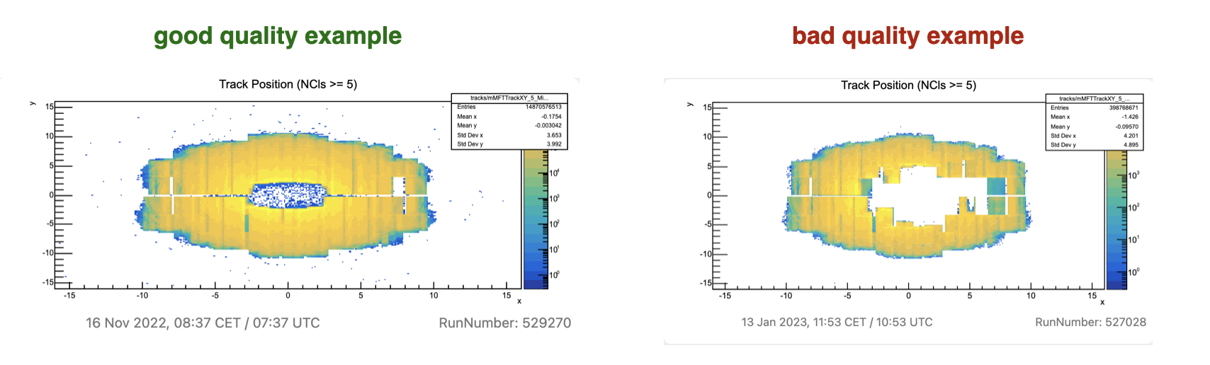
- Description: this plot is created on the EPNs and shows the track position in the X-Y plane (normalized by the number of LHC orbits).
- Checks to be done: the histogram should look similar to the reference (left) shown in this documentation.
- Actions to be taken: if the plot looks significantly different from the reference, call the MFT on-call.
Distribution of the #clusters per ROF#
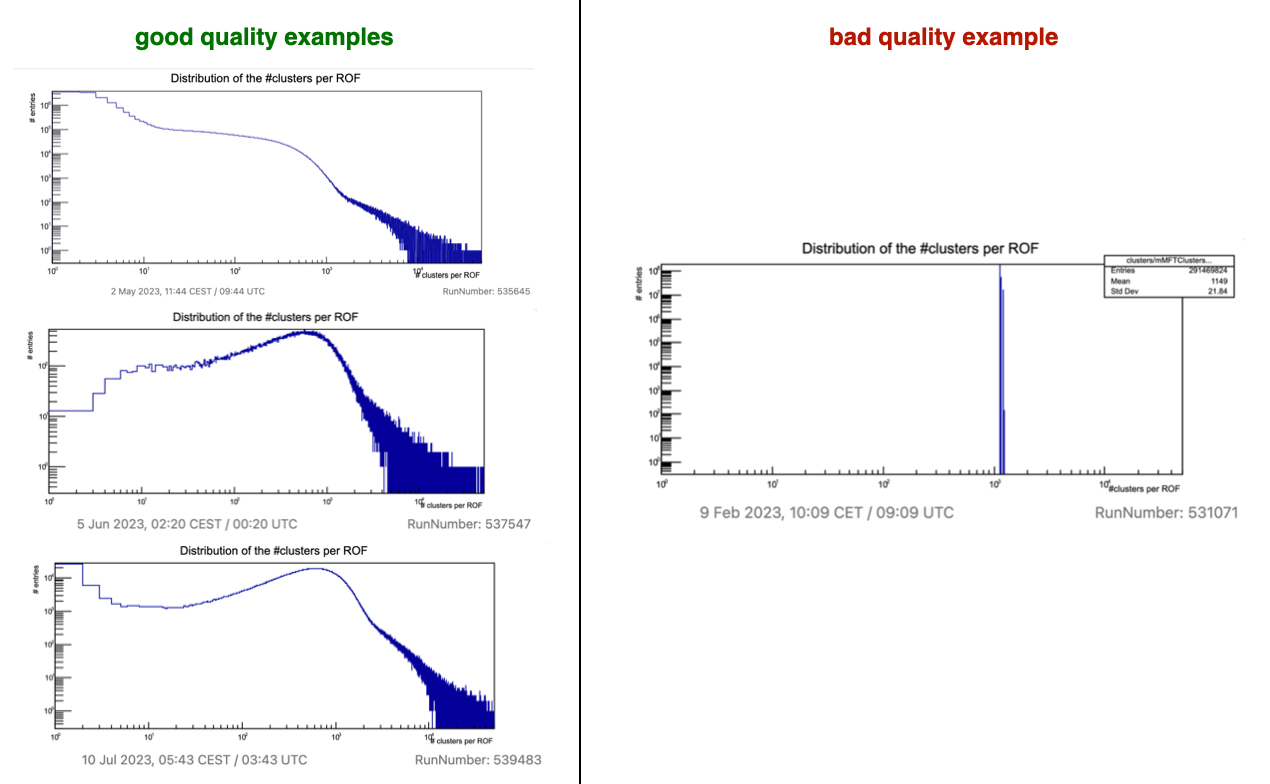
- Description: this plot is created on the EPNs and shows the number of clusters per MFT ROF (readout frame). The data are normalized by the number of LHC orbits.
- Checks to be done: the histogram should look similar to the reference (left) shown in this documentation.
- Actions to be taken: if the plot looks significantly different from the reference, call the MFT on-call.
Distribution of the #tracks per ROF#
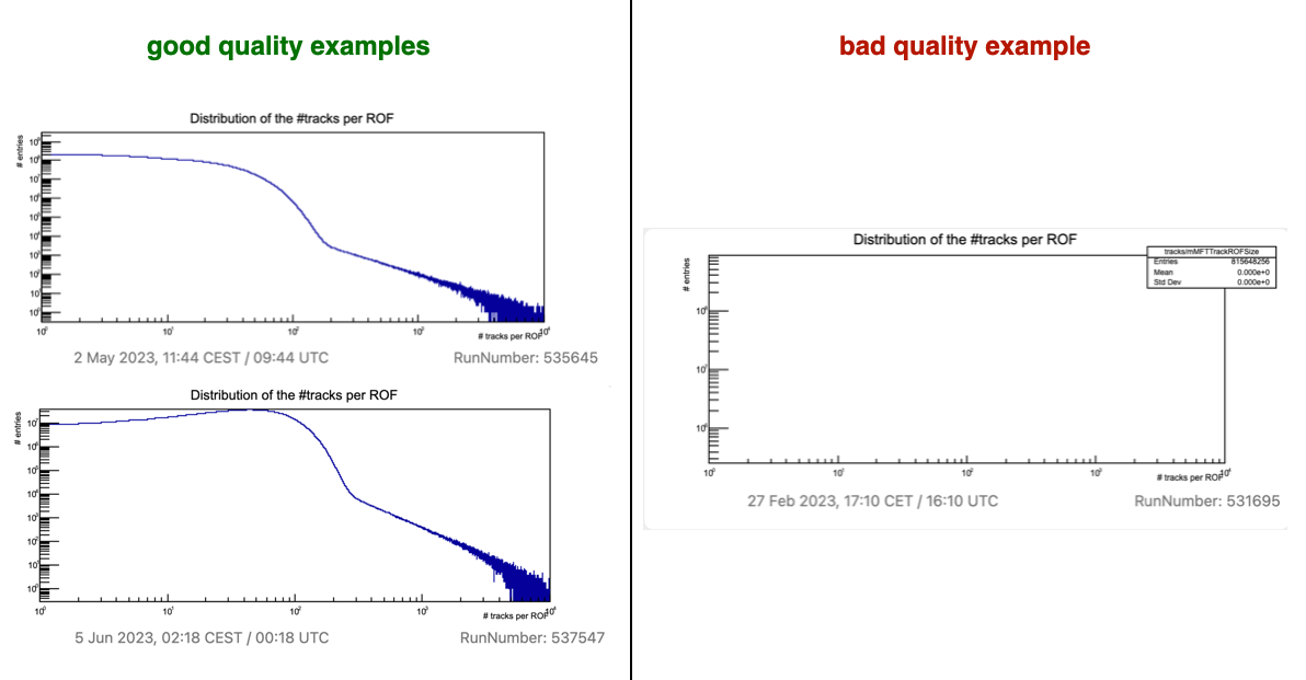
- Description: this plot is created on the EPNs and shows the number of tracks per MFT ROF (readout frame). The data are normalized by the number of LHC orbits.
- Checks to be done: the histogram should look similar to the reference (left) shown in this documentation.
- Actions to be taken: if the plot looks significantly different from the good reference, call the MFT on-call.
Known issues#
None